
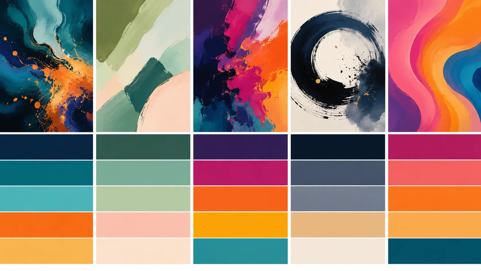
Good abstract digital art starts with control, not chaos. For abstract digital art, pick a limited color palette, build strong value contrast, give the viewer one clear focal point and use negative space on purpose. Complementary colors feel bold, analogous colors feel calm, monochromatic palettes feel polished and split complementary palettes give you contrast without as much visual noise. If you plan to print your work as stickers, test the design at the final size before you order.
Abstract digital art is easy to start and surprisingly hard to finish. You can add gradients, textures, brush marks, noise, glow effects and layered shapes forever. The hard part in abstract digital art is knowing when the piece has enough energy without turning into a pile of visual confetti.
That is why the best abstract digital art usually has a boring little secret behind it: structure. A strong palette gives the piece a mood. A strong composition tells the eye where to go. And once those two things are working, the fun effects actually have somewhere to land.
Start With The Job Of The Piece
Before choosing colors, decide what the artwork needs to do.
A phone wallpaper can be softer and moodier because the viewer sees it up close. A poster needs a stronger focal point because it has to work from across the room. A sticker needs the clearest read of all. It may be only 2 or 3 inches wide, so the big shapes, color contrast and silhouette matter more than tiny texture.
For abstract digital art, I like to ask three questions before I touch the palette:
What should the viewer notice first?
Should the piece feel calm, energetic, strange, elegant, playful or intense?
Will this be used on screen, printed, made into stickers or all three?
That last question matters. Bright RGB colors on a monitor can shift when printed. Fine noise and tiny lines can disappear when scaled down. A glowing blue shape may look great on screen but turn muddy if the background value is too close. The earlier you know the final use, the easier the design choices become.
Best Color Palettes For Abstract Digital Art
The safest way to make abstract digital art look intentional is to limit the palette. That does not mean the piece has to be dull. It means every color needs a job.
Complementary Palettes For High Energy
Complementary colors sit opposite each other on the color wheel. Blue and orange, purple and yellow or teal and coral all create instant tension. This is great when you want abstract digital art to feel bold and alive. It is also one of the fastest ways to make abstract digital art stand out in a feed.
The trap is using both colors at full strength across the whole canvas. That can get loud fast. A better approach is to let one color dominate and use the opposite color as the spark.
Try this:
60% deep blue
30% smoky purple
10% hot orange
That tiny orange accent can carry the whole piece. Put it near the focal point, repeat it once or twice in smaller marks and let the cooler colors do the heavy lifting.
Analogous Palettes For Calm Flow
Analogous colors sit next to each other on the color wheel. Blues, teals and greens work well together because they share a temperature. Reds, oranges and yellows do the same in a warmer direction.
This palette type is useful when abstract digital art needs to feel smooth, atmospheric or natural. It is also forgiving. You can layer translucent shapes, soft gradients and painterly textures without the colors fighting each other.
A strong analogous palette might look like this:
Forest green
Deep teal
Soft cyan
Near-black navy
Warm off-white
The key is value contrast. If all the colors are medium-dark, the piece may feel flat even if the hues are beautiful.
Monochromatic Palettes For A Polished Look
A monochromatic palette uses one main hue with different tints, shades and saturation levels. Think navy, cobalt, pale blue and blue-gray.
This is one of the best options for abstract digital art that needs to feel refined. For abstract digital art, it is also a good choice for product art, album covers, packaging accents or minimalist stickers.
The challenge is avoiding sameness. Use texture, scale and light-dark contrast to keep the piece moving. A monochromatic palette works best when the values are clearly separated: one deep anchor, one midtone area and one light highlight.
Split Complementary Palettes For Balanced Drama
A split complementary palette uses one main color plus the two colors on either side of its opposite. It gives you contrast, but it is usually easier to control than a direct complementary pair.
For example, start with teal. Instead of using straight red as the opposite, use coral and warm violet. The result still has energy, but it feels less harsh.
This is a strong choice for abstract digital art that needs personality without looking messy. Use the main color as the field, the two accents as motion and a neutral as the resting place.
Use Value Contrast Before Saturation
Color gets most of the attention, but value does more of the work.
Value means lightness and darkness. If you turn the artwork to grayscale and everything blends together, the composition probably needs more value separation. This is one of the simplest tests for abstract digital art because it removes the distraction of hue.
A good value structure might include:
A dark anchor shape
A midtone texture field
A bright focal accent
A few small connecting marks
Once that structure works in abstract digital art, color becomes easier. You can make the piece neon, earthy, pastel or monochrome and it will still hold together.
Saturation should also have hierarchy. Not every color should shout. Let most of the artwork stay muted, then use one saturated color where you want attention. Bright colors attract the eye, so treat them like arrows.
Composition Tips That Keep Abstract Digital Art From Feeling Random
Abstract digital art does not mean accidental. The viewer may not see a character, object or landscape, but they still need a path through the piece.
Give The Eye One Main Focal Point
Pick one area to be the star. It can be a bright shape, a dense cluster of marks, a sharp line crossing a soft field or a high-contrast color shift.
Then make the rest of the composition support that focal point. Secondary shapes should point toward it, echo it or balance it. If five areas are all competing, the viewer has no reason to stay.
For sticker art, this matters even more. Small printed pieces need a fast read. A strong focal point keeps abstract digital art from turning into decorative static.
Use Negative Space On Purpose
Negative space is the quieter area around the active parts of the design. It does not have to be plain white. It can be a dark field, a pale gradient, a soft texture or a calm color block.
The point is breathing room. If every inch has the same amount of detail, nothing feels important.
A simple rule: leave at least one area less busy than you think it should be. That quiet space can make the active areas feel stronger.
Try The Rule Of Thirds, Then Break It Carefully
The rule of thirds divides the canvas into a 3-by-3 grid. Placing the focal point near one of the intersections often feels more natural than putting it dead center.
This works well for abstract digital art because asymmetry creates movement. Put the main shape slightly off-center, then use smaller elements to balance the opposite side.
The golden ratio can work too, especially for flowing compositions. But do not get trapped trying to make the math perfect. Use these systems as guides, not handcuffs.
Build Rhythm With Repetition
Repetition makes abstract art feel designed. Repeat a shape, line angle, texture or color accent in different sizes. A big circle, a medium circle and a tiny circle can create rhythm without feeling copy-pasted.
This is also useful for sticker sheets. If you are making several pieces from one abstract digital art set, repeat a palette or visual motif so the sheet feels connected.
Make Abstract Art Work As Stickers Or Prints
A design can look great on screen and still need adjustments before print.
If you want to turn abstract digital art into physical pieces, think about size, finish, edges and surface. CustomStickers.com is a good fit for this kind of work because abstract designs often benefit from clean die cuts, durable vinyl and finish choices that change the mood of the piece.
For example, custom vinyl stickers work well for bold abstract shapes, laptop art, water bottles and artist merch. Clear stickers can look sharp when the empty space is part of the composition. Holographic stickers can be great for cosmic gradients, chrome-style effects and iridescent abstract accents, but they work best when you let the holographic material support one part of the design instead of covering everything with equal intensity.
Before ordering, check these details:
View the art at the final printed size.
Keep important details away from the cut edge.
Use thicker lines than you think you need.
Make sure the focal point still reads in grayscale.
Use a high-resolution file, ideally 300 PPI at final size.
Ask for a proof when the cut shape or border matters.
A full-bleed abstract design can look great, but it needs clean prep because the art runs to the edge. A bordered design is usually safer if the artwork has small marks near the outside.
A Simple Palette And Composition Framework
Here is a practical way to build abstract digital art from scratch.
Start with one mood word. Try “electric,” “quiet,” “botanical,” “cosmic,” “warm,” “icy” or “industrial.”
Choose one dominant color family. This becomes the visual home base.
Choose one contrast color. Use it sparingly.
Choose one neutral. This gives the eye somewhere to rest.
Make a grayscale sketch with three values before adding final color.
Place the focal point off-center.
Add one repeated motif to create rhythm.
Remove 10% of the detail before calling it done.
That last step hurts a little. It also helps. Most abstract digital art improves when the composition gets clearer.
Common Mistakes To Avoid
The first mistake is using too many colors at equal volume. A rainbow palette can work, but only when value, spacing and hierarchy are controlled.
The second mistake is adding texture everywhere. Texture is useful when it creates contrast. If the whole piece has the same noise level, the texture stops helping.
The third mistake is forgetting the final format. A 4000-pixel canvas gives you room for subtle details. A 2-inch sticker does not. If the artwork will be printed small, make the silhouette stronger and simplify the interior marks.
The fourth mistake is centering everything by default. Centered compositions can be powerful, but they need intention. Off-center balance usually gives abstract digital art more movement.