Top 10 Clear Sticker Design Mistakes for Glass, Bottles, and Windows
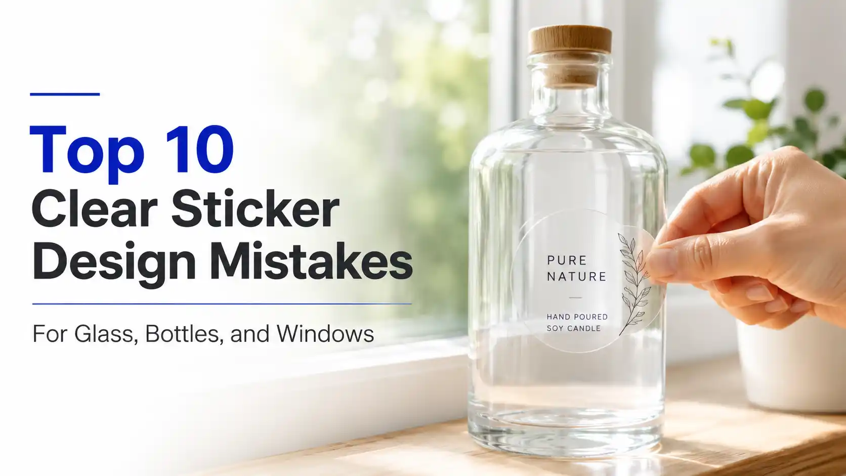
TLDR Clear sticker design works best when you plan for transparency, contrast, white ink, surface color, and lighting. The biggest mistakes are treating clear vinyl like white vinyl, forgetting that colors can disappear on dark surfaces, using delicate type, ignoring white underbase, and not testing the sticker on the actual surface. Clear stickers are beautiful. … Read more

Custom Bumper Stickers: How to Design and Order Them

TLDR Custom bumper stickers should be simple, readable, durable, and designed for real vehicle use. Start with one clear message, choose a size that fits the design, use strong contrast, and pick an outdoor-friendly material. A proof is worth reviewing carefully because bumper sticker mistakes tend to become very visible in traffic. For most projects, … Read more

Top 10 Outdoor Vinyl Sticker Design Mistakes That Kill Weatherproof Stickers

TLDR Outdoor vinyl sticker design mistakes usually happen before the sticker ever touches rain, sunlight, laptops, cars, coolers, helmets, or water bottles. Bad material choice, weak contrast, tiny text, thin lines, poor placement, missing laminate, and ignoring surface prep can all shorten sticker life. Weatherproof stickers are tough. They are not magic talismans. Outdoor vinyl … Read more

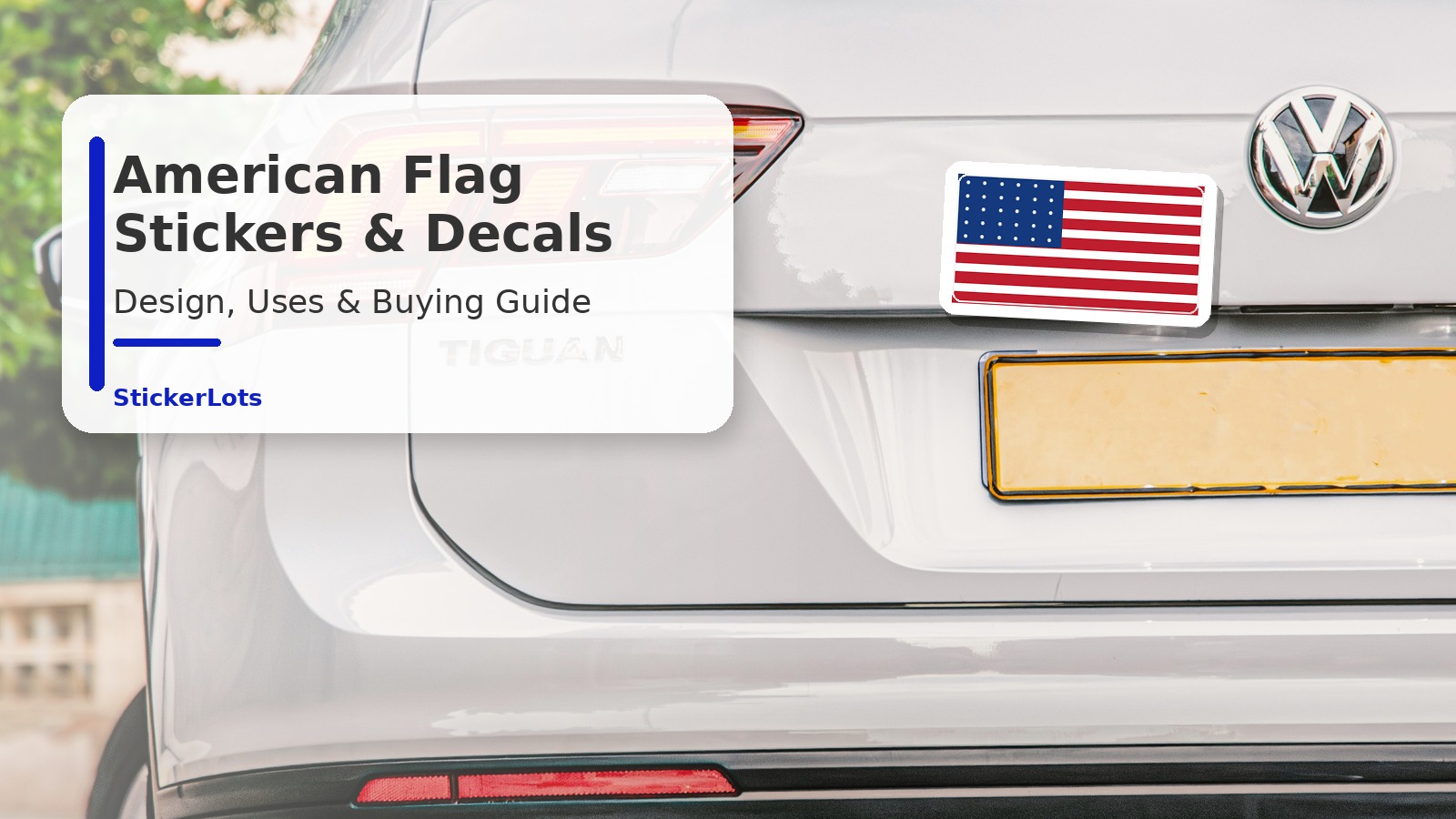
American Flag Stickers and Decals: Design, Uses, and Buying Guide

TLDR American flag stickers and decals work best when the design is clean, readable, and suited to the surface. Use vinyl for cars, laptops, water bottles, helmets, toolboxes, storefronts, packaging, and outdoor gear. Choose a finish based on visibility: gloss for punchy color, matte for lower glare, and clear vinyl when you want the surface … Read more

Abstract Digital Art: Color Palettes And Composition Tips That Actually Work

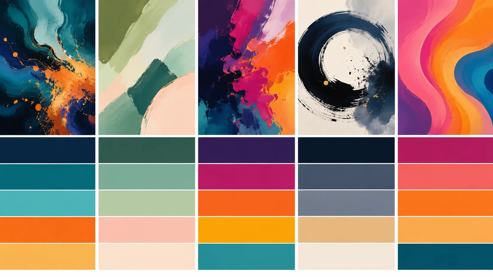
Good abstract digital art starts with control, not chaos. For abstract digital art, pick a limited color palette, build strong value contrast, give the viewer one clear focal point and use negative space on purpose. Complementary colors feel bold, analogous colors feel calm, monochromatic palettes feel polished and split complementary palettes give you contrast without … Read more